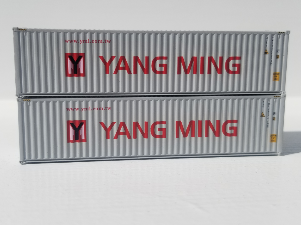
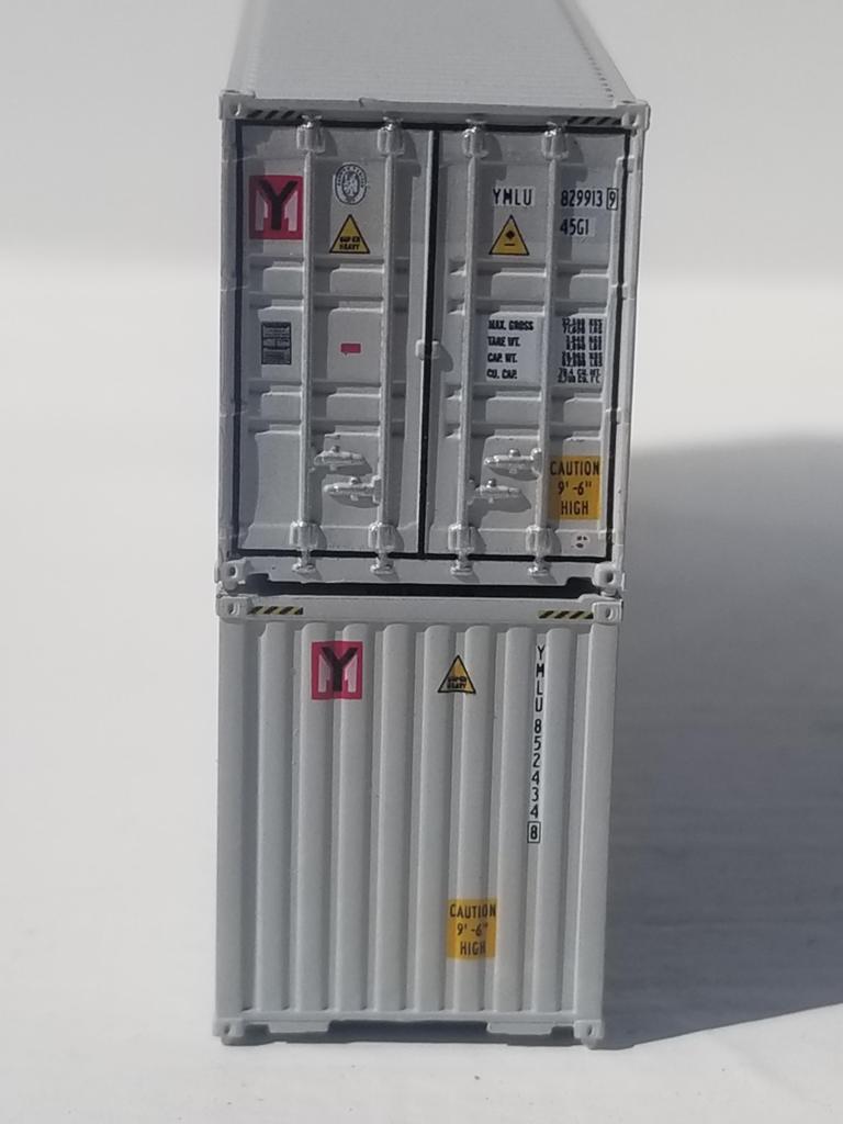
Model Information: All New Tooling; -42- corrugated sidesSeven different door variations tooled: molded as appropriate IBC(Inter-Box Connecting pins) in scale ISO locations JTC Magnetic connecting system: 3-magnets bottom & metal top plate Detailed printing as per photographs
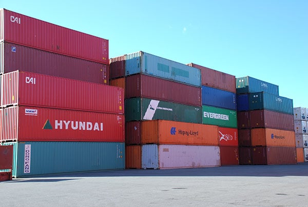
Prototype History: The 40 foot container is the king of the container business. It is the most common standard container size used for international and domestic shipping. Most intermodal operations that handle overseas shipping are optimized for this container size. These containers are typically reinforced for loading, unloading and transportation by ship.
Dry containers are meant for non-refrigerated goods and hence are the most common type.
Corrugation in the construction of these containers yields much greater strength (just like with corrugated cardboard for boxes) but is more expensive to fabricate. Due to the extra strength granted by the corrugation, this is a popular type for overseas use.
Road Name History: Yang Ming Marine Transport Corporation (Yang Ming) was established on December 28, 1972. This is an ocean shipping company based in Keelung, Taiwan (ROC). This shipping line was founded in 1972, but has historical links through its merger with the China Merchants Steam Navigation Company, which dates back to the Qing Dynasty (1872–1995). The Yang Ming Group includes a logistics unit (Yes Logistics Corp. and Jing Ming Transport Co.), container terminals in Taiwan, Belgium, Netherlands and the USA, as well as stevedoring services (Port of Kaohsiung, Taiwan). Yang Ming's service scope covers over 70 nations with more than 170 service points.
About the company name and logo
Literal meaning: "Yang Ming" is transliterated from its two Chinese characters "陽明. "Yang Ming" refers to the sun and lightness. "Yang" refers to the sun, whereas "Ming" is the combination of the sun and the moon and often denotes "brightness," "clarity" or "enlightenment."
Logo Meaning: The logo is a square block shape integrated with our initials "YM". The "Y" stretches out from the bottom to the top, which signifies Yang Ming's endeavor for innovation. The "M" stands for grandeur, width and firmness, which implies that Yang Ming's employee teams work honestly and pragmatically for effective results. The Yang Ming logo also delivers Yang Ming's core values of "Teamwork, Innovation, Honesty and Pragmatism."
About the company colors
The Red color implies Yang Ming's managing philosophy of sincere service.
The Grey color stands for Yang Ming's core values.
Teamwork-oriented: Grey is the mixture of black and white. It means successful work is done by the coordination and communication of mutual parties. Innovative: Grey has the feeling of modern life and technology, which meet the spirit of innovation.
Honest and Pragmatic: Grey is a neutral color, not shining but also not so ignorable. Grey is a reliable color that embodies the pragmatic goals of doing the job right the first time.
Source: Yang Ming's website.
Brand/Importer Information: Now featuring our new line of 1:160 scale models. Developed using the latest in global technology & CAD systems, these New 2017 tooled models feature IBC connecting pins AND our Magnetic connecting system, and are decorated with detailed prototype printing. Our JTC container series of models offer Multiple door styles and variants to match prototypes. The First release is a 'Rib-style' corrugated side Canvas/Open top container, Now In Stock. Our second release is the more common 'wave' corrugation sides version, expected January 2018. Both are New to N scale. Release styles 3 & 4 will be around March 2018, and will be 2 of the most popular container styles in use. Please read our 'Latest News' section for updates. Thank You for visiting. New Facebook page: www.facebook.com/JTCmodeltrains
Item created by: Jenna on 2019-03-14 15:36:57. Last edited by Jenna on 2019-03-14 15:37:42
If you see errors or missing data in this entry, please feel free to log in and edit it. Anyone with a Gmail account can log in instantly.
If you see errors or missing data in this entry, please feel free to log in and edit it. Anyone with a Gmail account can log in instantly.


